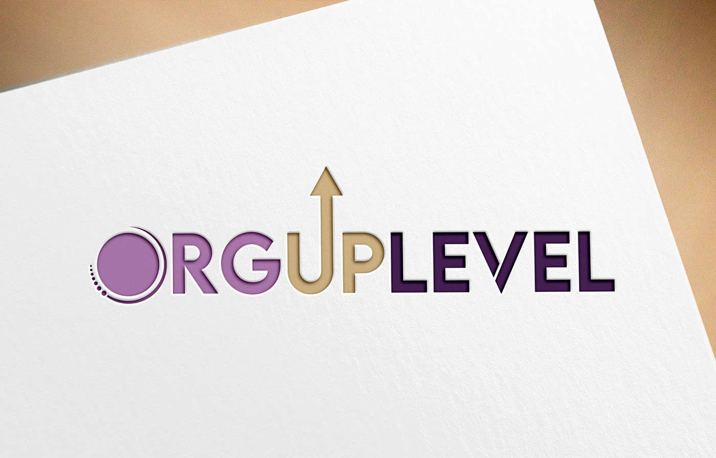
The logo is designed with a sleek and modern aesthetic, primarily utilizing shades of purple and a beige color. The company name "ORGUPLEVEL" is split into two parts for visual impact: "ORG" and "UPLEVEL".
The "ORG" segment is in a lighter purple, featuring a unique graphic element that resembles a stylized letter "O" with a circular motif. This motif consists of a series of graduated dots that decrease in size, suggesting dynamism and growth, or possibly a loading icon that indicates progress or technological processes.
The "UPLEVEL" segment is presented in a darker shade of purple, conveying depth and sophistication. Between the two parts of the text, a beige upward-pointing arrow integrates into the letter "U" of "UPLEVEL", symbolizing growth, success, or advancement, which aligns with the upward movement suggested by the company name.
The font is modern and sans-serif, with clean lines that convey a sense of professionalism and forward-thinking. The arrow's color contrasts with the purple, making it stand out as a focal point.
The overall design is minimalistic yet meaningful, with the use of color and graphic elements working together to create a sense of innovation and upward momentum. This logo might be well-suited for a company in the technology, consultancy, or professional development sectors where growth and advancement are key aspects of the brand identity.
**********Order Now***********
**********Order Now***********


